Peak Hours / 高峰
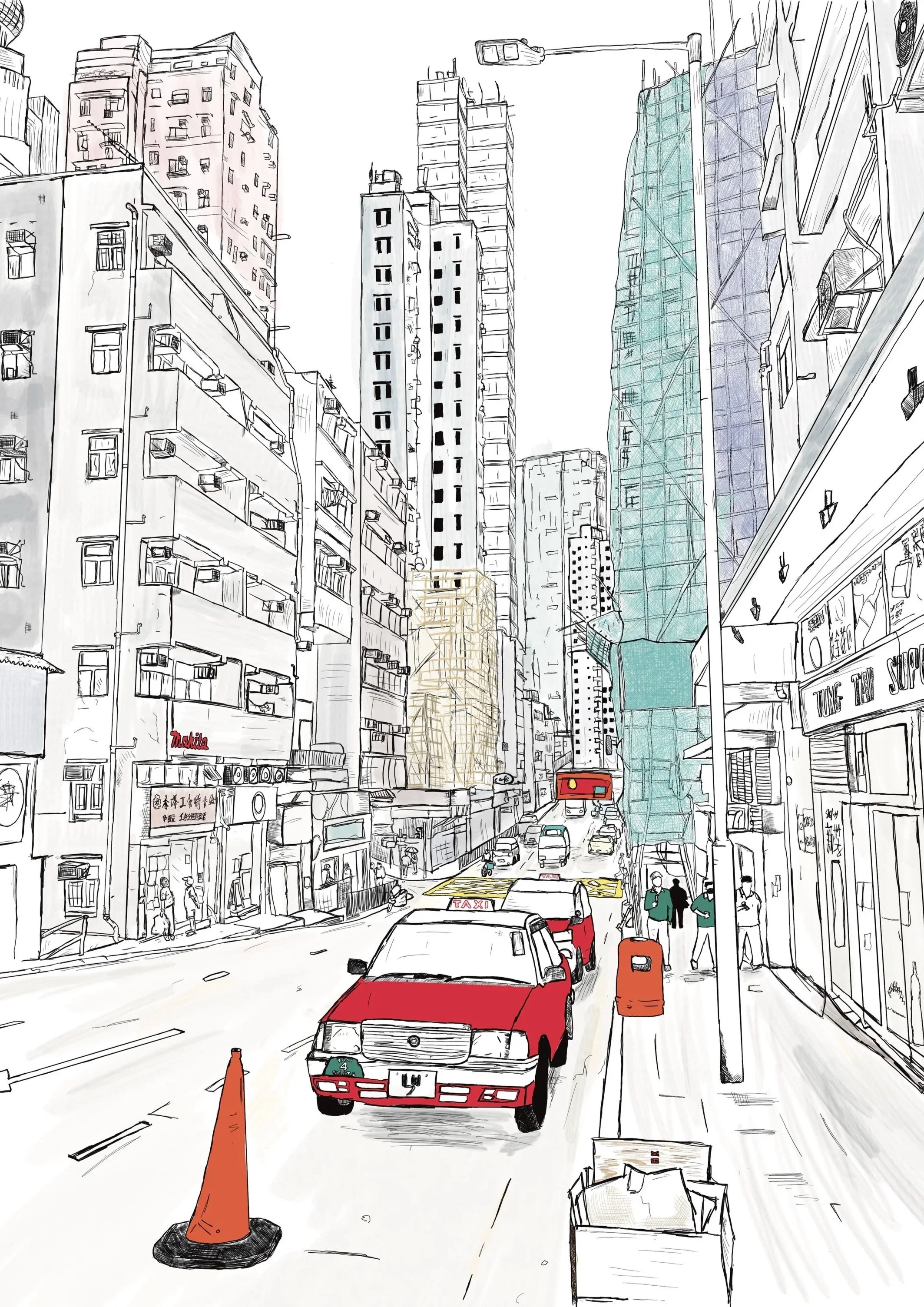
Peak Hours is an ongoing surface pattern design project drawing inspiration from the crossover of nature and the urban sprawl of Hong Kong
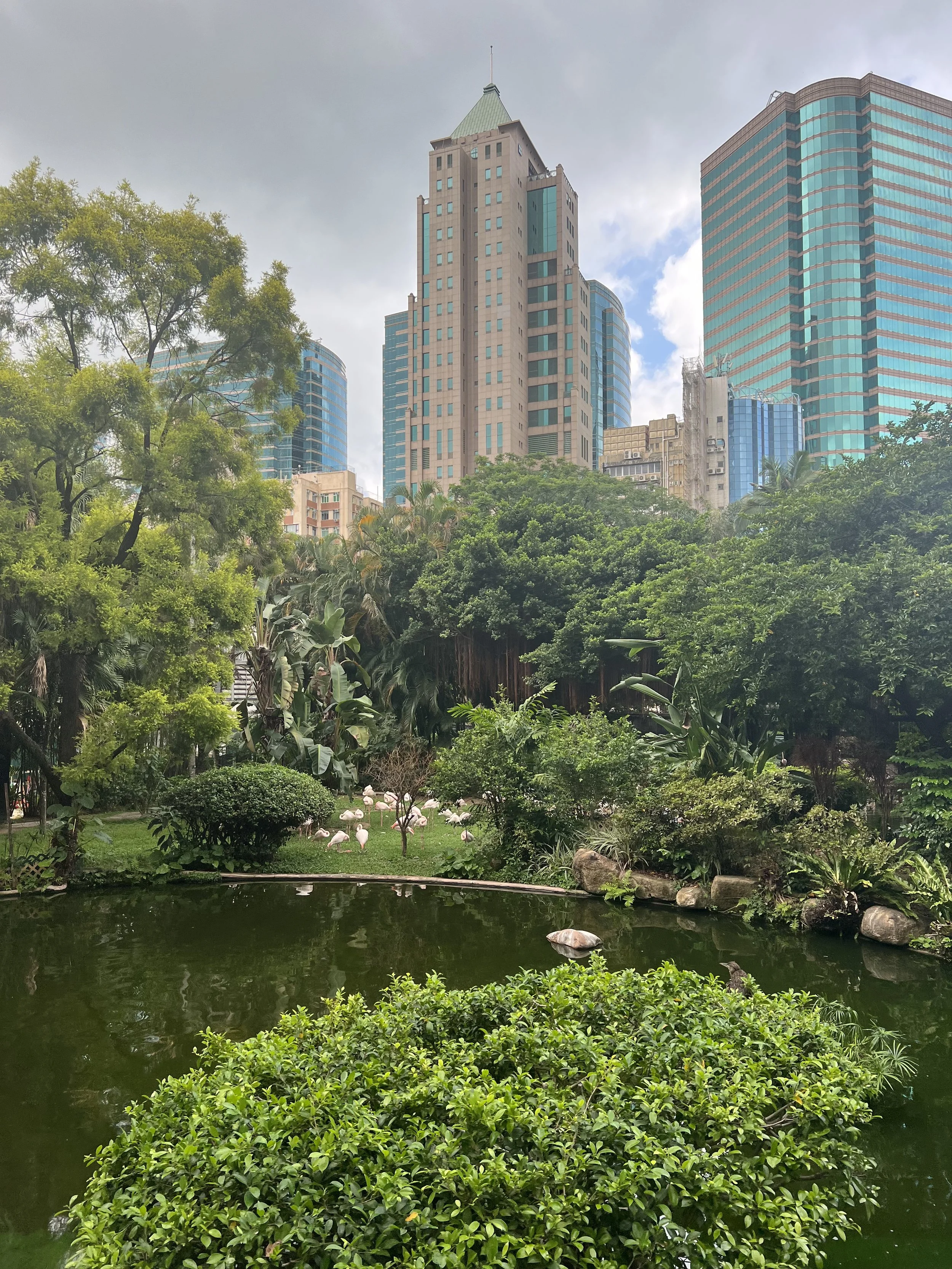
Flamingoes in Kowloon Park, Tsim Sha Tsui
O R I G I N S
The starting point of Peak Hours began on a trip to Hong Kong, I was walking through Kowloon Park and came across groups of flamingoes gathered against lush vegetation in front of towering skyscrapers.
Of course, flamingoes are not native to Hong Kong - they had been placed in the parks landscape. However this unexpected scene of nature against the backdrop of urban sprawl really caught my attention and prompted me to explore the relationship between organic forms and Hong Kong’s built environment.
An iconic feature of Hong Kong’s urban landscape is its bamboo scaffolding. I was particularly drawn to its use of a natural material to construct and maintain the towering architecture of the city. This feels central to Peak Hours - the overlap of a natural form and functional part of the environment.
Further into the collection, I will explore the areas native flora and fauna alongside other elements of the city’s urban landscape, continuing to investigate the relationship between the natural and built in environment.
C O L O U R
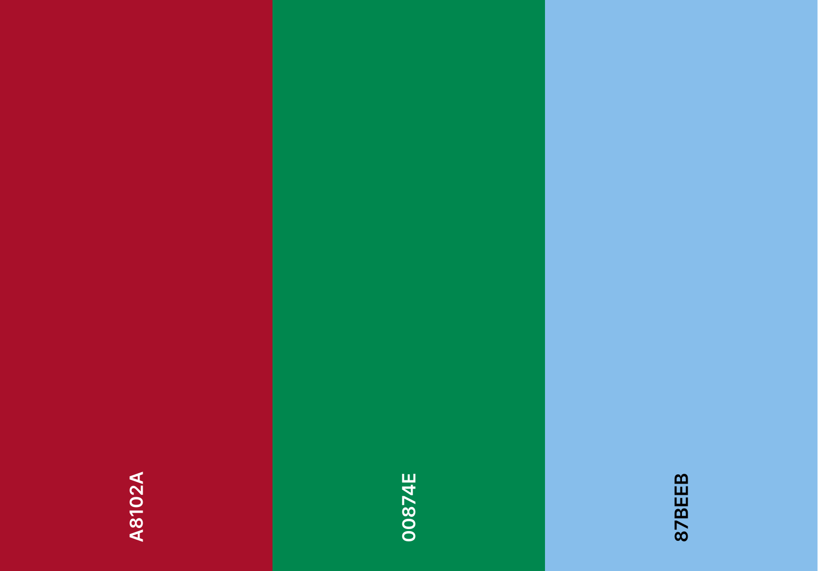
Colour within Peak Hours begins with one of Hong Kong’s most recognisable features - its taxis. Hong Kong’s taxis are distinguished by three colours, each associated with a different operating area:
RED - urban taxis
GREEN - New Territories
BLUE - Lantau Island
These three colours form the foundation of the collection’s palette.
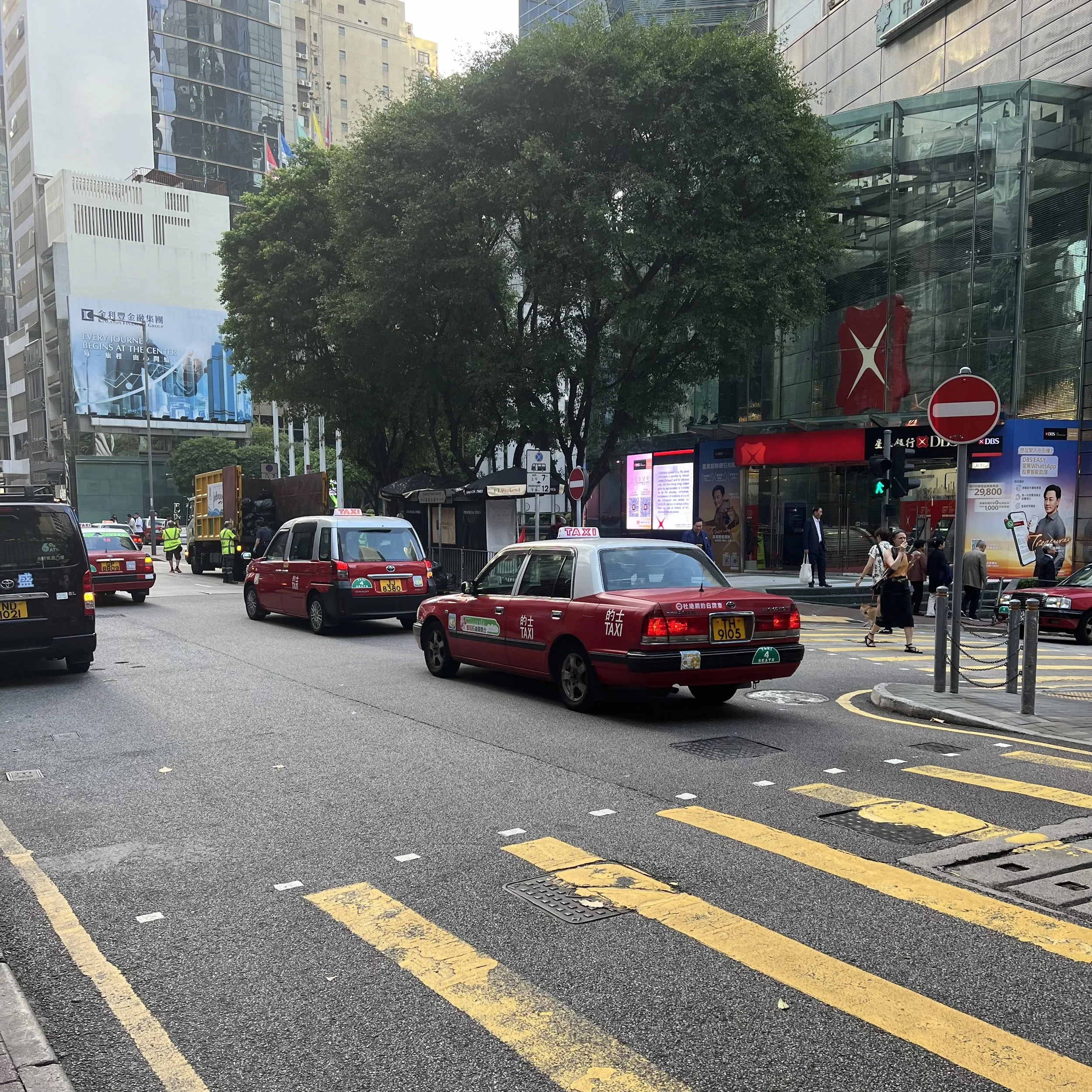
Urban Taxis, Queen’s Road, Central
When considering my supporting colours I looked at elements of Hong Kong’s character. The area offers a plethora of visual references to draw from - neon signage in Mong Kok, air-con units breaking up façades and bamboo scaffolding interrupting the architecture. However, this largely represents the built environment. To balance this I looked towards the native flora and fauna.
Some species of banyan tree are native to Hong Kong, their distinctive roots not only providing an interesting visual to draw from, but also to look at in terms of a neutral colour to ground the collection.
Another natural element I looked towards was the bauhinia flower. This appears prominently on the regions flag, and the purple shades of the flower offer another colour to draw from - brightening the palette.
I have named these colours after the region that has inspired it:
Urban Red
Territory Green
Lantau Blue
Rather than directly copying the shades, I have interpreted these to keep them cohesive with the collection. Urban Red, for example is a rich, almost dark tone, which complements the powdery shade of Lantau Blue.
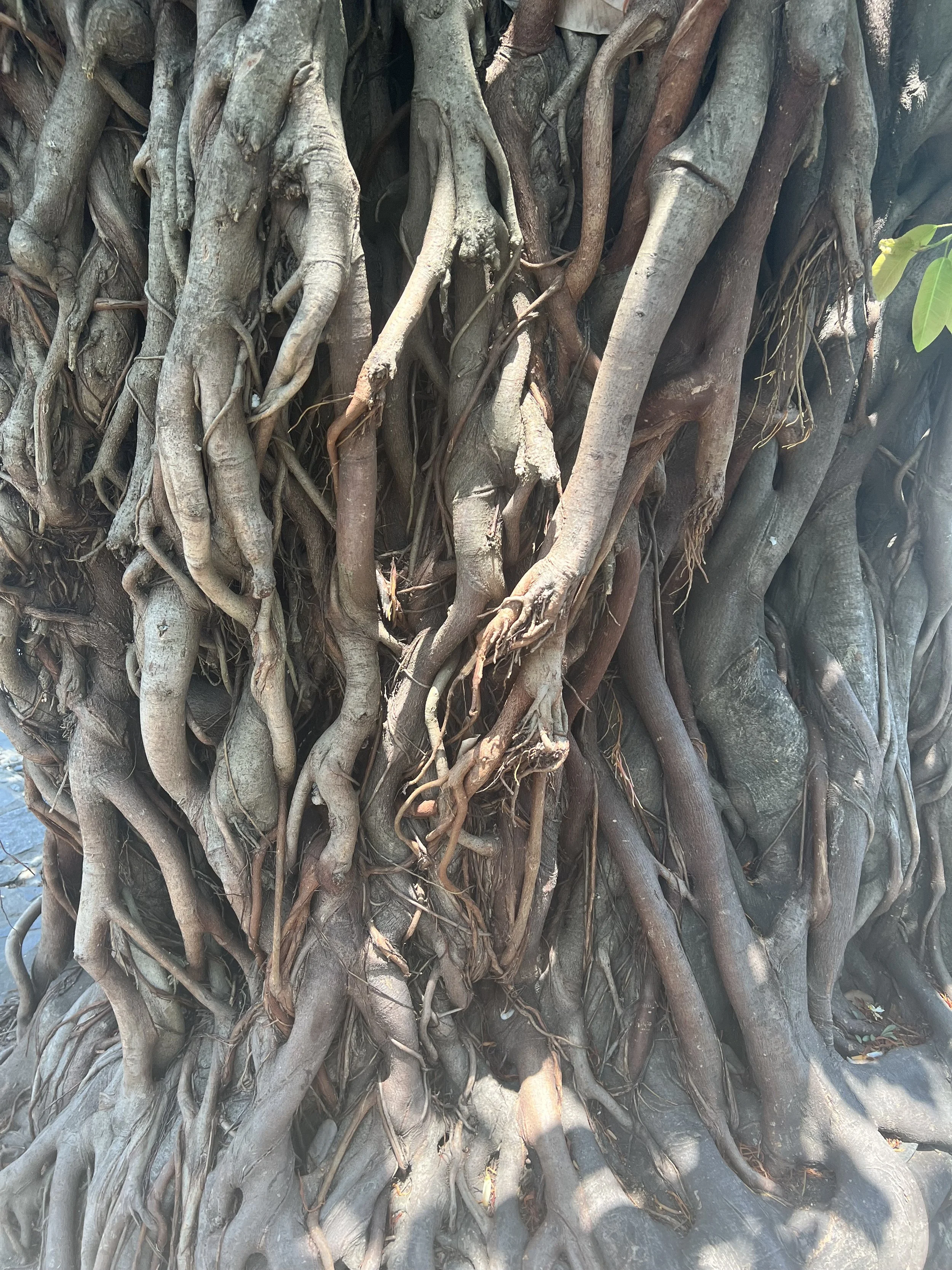
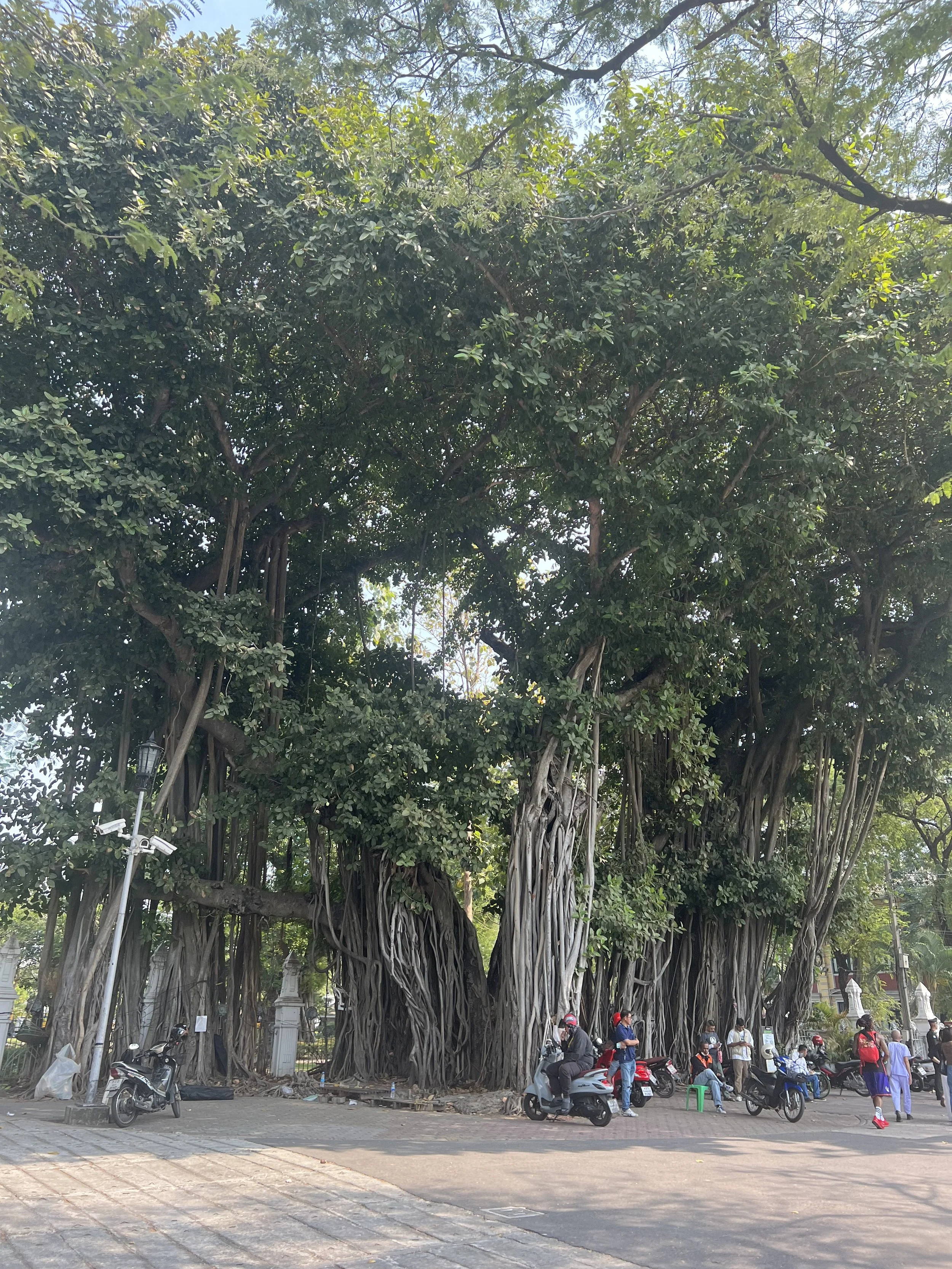
Potential banyan tree roots, Nha Trang, Vietnam / Banyan Tree, Bangkok, Thailand
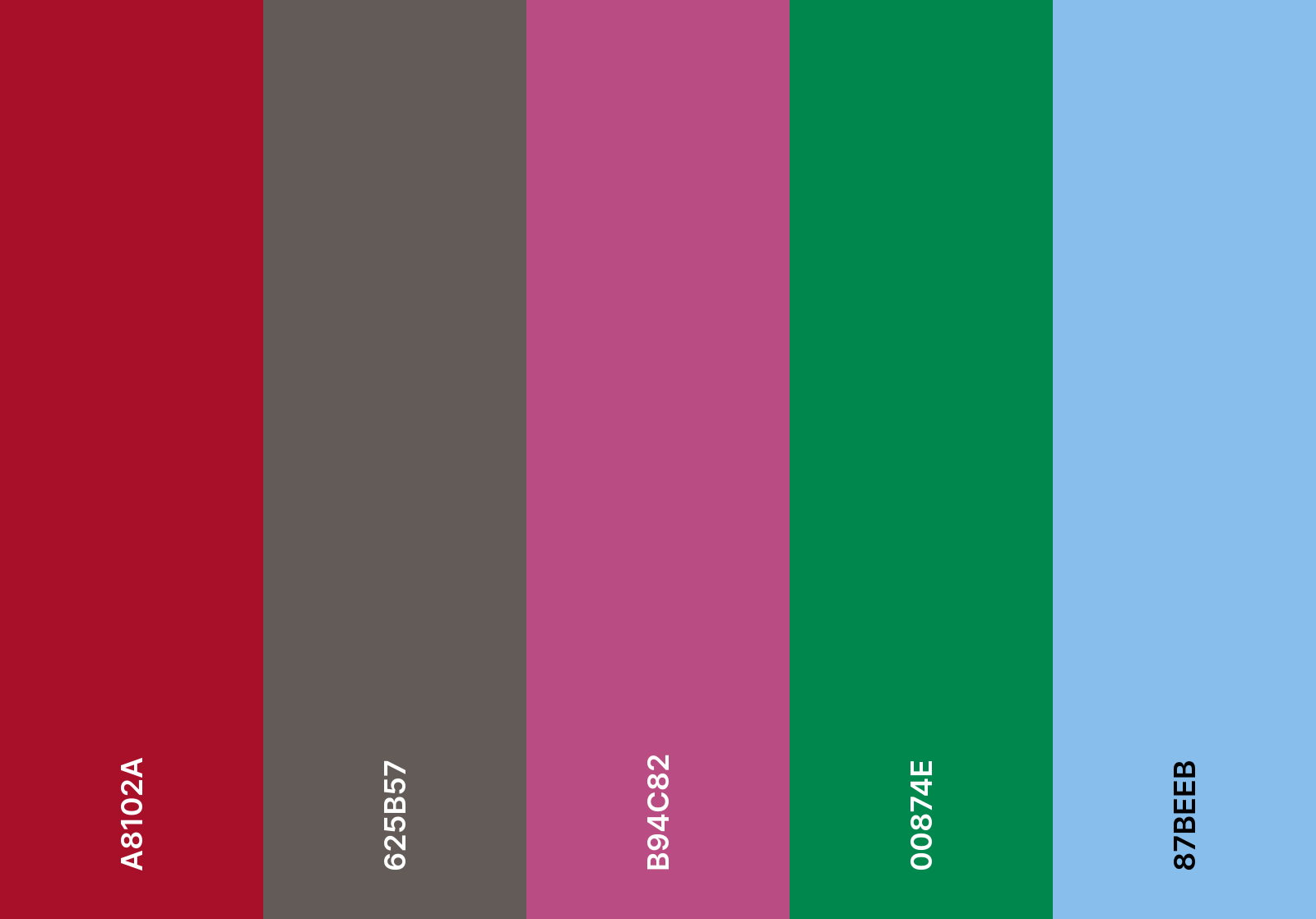
This led me to these five colours:
Urban Red
Banyan
Bauhinia
Territory Green
Lantau Blue
Looking at these I have four vibrant shades, and one grounding neutral. whilst the red, green and blue will be dominant colours in their own way - such as urban red reflecting more architectural repeats - the purple provides an accent whilst the brown provides depth.
Finally, introducing a lighter neutral at this point to provide breathing space is needed. Looking again to the man made structures of Hong Kong, I have decided to use the abundance of air con units as an appropriate reference, their off white/grey tone offering a quieter shade amongst the collection.
However, Part of me is considering using bamboo as a reference. This could offer another neutral shade, bridging the two neutral shades together. This would give me a total of seven colours to work with - eight if you include the black, expressive linework.
In previous print projects I have used less colours. For example in Ilha I used five, and in narratives in design three were used. Working with a potential of eight colours does feel extensive and potentially chaotic, however, part of what I wanted to communicate within this collection was chaos. Peak Hours initially had a double meaning: a reference to the natural landscape and Victoria peak, but also peak hours of activity and the visual chaos of the urban sprawl.
With this in mind, a broader palette may actually benefit the collection rather than overwhelming it, providing each colour is balanced in their usage within repeats.
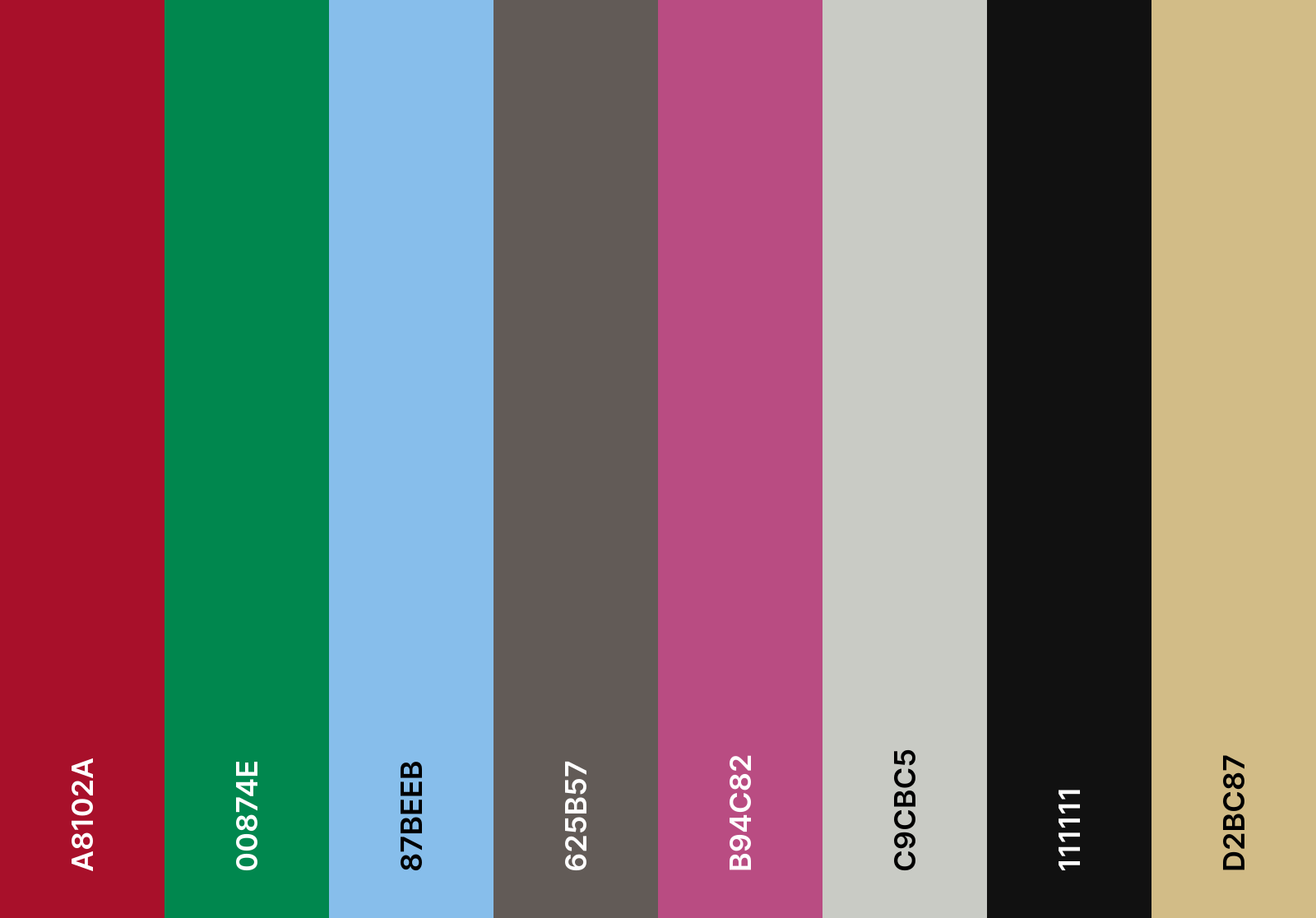
Finalised Colour Palette:
Urban Red
Territory Green
Lantau Blue
Banyan
Bauhinia
Unit
After Hours
Bamboo